Winamp skins: Miscellaneous
Click the image to download.

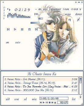
Title: Ai Oboete Imasu Ka (Do You Remember Love?)
Series: Super Dimension Fortress Macross
Who: Ichijo Hikaru and Hayase Misa
Font: Quill
Click here
for larger image.
Notes: A pretty pic for the Macross series. I've never been entirely
sure if this pic is fan art or series art, but I love it anyway. Extra
simple skin; almost no editing to the image, not-at-all-fancy-pledit.
Very plain, but it just seems to work.

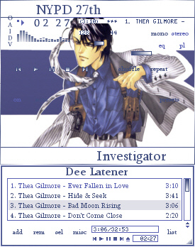
Title: Dee Latener, NYPD 27th Investigator
Series: FAKE by Manami Satoh
Who: Dee Latener
Font: Sylfaen
Click here
for larger image.

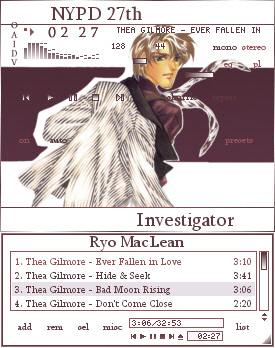
Title: Ryo MacLean, NYPD 27th Investigator
Series: FAKE by Nanami Satoh
Who: Randy "Ryo" MacLean
Font: Sylfaen
Click here
for larger image.
Notes: These are a couple of images I've had around for a while. I scanned
the covers of the original Japanese manga, and then let the images sit
around collecting virtual dust on my hard drive, because they weren't
working out just right. They taunted me, too, the bad boys. *grin*
Finally I took the original images, started over and just finished
the darn things. They're a matched set, of course, just like Dee and Ryo
in the books. Nothing at all fancy, here. Plain and straightforward.

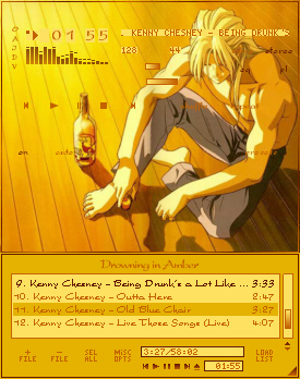
Title: Drowning in Amber
Series: Gundam Wing
Who: Zechs Marquise
Font: President
Click here
for larger image.
Notes: Something that is mostly Quill's fault. She showed me this pic
of Zechs, at a time when I had seen zero "Gundam Wing", and it
nagged at me until I skinned it. I did absolutely NO editing to this
image; it would have completely interferred with the effect of the
golden floor and late afternoon sunlight and the amber of the whisky.
To download the font (it's free), go to Cool Archive.

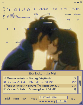
Title: Hitoribotchi Ja Nai
Series: Super Dimension Fortress Macross
Who: Ichijo Hikaru and Hayase Misa
Font: OakWood
Click here
for larger image.
Notes: I have finally got Macross on DVD. The image itself is probably
a screenshot from the movie "Do You Remember Love?", but that's all
right. I did do quite a bit of editing to the backgroud of this image;
the original scan had a mesh-like background and I hated it. So
I fudged around until I had a softer light effect behind them, that matched
pretty well with the original background color. One of my favorite pics.
To download the font (it's free), go to Cool Archive.

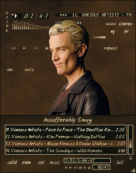
Title: Insufferably Smug
Series: Buffy the Vampire Slayer
Who: Spike
Font: Josschrift
Click here
for larger image.
Notes: You mean I need to put something down here? The pic doesn't just
speak for itself? Oh, well. I sized the pic, and then made a new background
for it, using similar colors (and pattern, too) to the original. And, c'mon.
Doesn't he just look completely, totally and insufferably smug? (And
sexy. Let us not forget sexy.) Reason enough, right there. *cheeky grin*

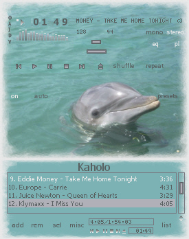
Title: Kaholo
Series: N/A
Who: Kaholo
Font: Tahoma
Click here
for larger image.
Notes: Yet another skin for kita73; this time of her "boyfriend", i.e.,
one of the dolphins she swam with on her vacation in the Bahamas. Have
I mentioned yet how jealous I am over that? *grin*

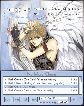
Title: No More Chains
Series: Angel Sanctuary
Who: Mudo Setsuna
Font: Geometr231 BT
Click here
for larger image.
Notes: Setsuna wielding the Nanatsusaya. Lovely art. I played with the
background to give it that scattered cloud look . . . just so it would match
the playlist better. *facepalm* I'm suitably ashamed. (And yes, his eyes
were like that in the original picture I scanned, too.)

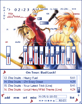
Title: On Tour: Bad Luck!
Series: Gravitation
Who: Nakano Hiroshi and Shindou Shuichi
Font: Tahoma
Click here
for larger image.
Notes: One of those images that just seems to work, without a
great deal of editing. I did flip the image, but that's all I did to
it. Unfortunately, it seemed that the pledit was too, too white, so
I got a little happy with the music note stamp. *sigh*

Title: On Wings of Love
Series: The Vision of Escaflowne
Who: Hitomi Kanzaki and Van Fanel
Font: Script MT Bold
Click here
for larger image.
Notes: I hang my head, but on my honor, I could not think of another title. This skin
has languished for nearly a year on my hard drive, waiting for me to figure out a way to
make it work. While my problems usually stem from positioning, this one stemmed from
colors. I could not find a color combination that didn't look like something that
someone with no color sense had just thrown together. The original pic was one I
had had for something like forever, a very long piece that was, I think, meant for
nothing but to showcase Van's lovely wings. Which I am a total sucker for, btw.
*grin*

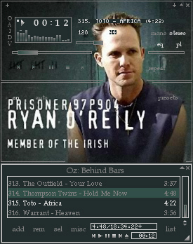
Title: OZ: Behind Bars
Series: OZ
Who: Ryan O'Reily
Font: Book Antiqua
Click here
for larger image.
Notes: This skin was made especially for kita73. She wanted a skin of her
favorite bad boy on "OZ", and couldn't find one anywhere. I helped her out.
I've never watched this series. I did the best I could, trying to give a
prison "feel" to the skin. It took a long time to decide about the
eq bars in the alternate eq; I'm still not sure they're just right.

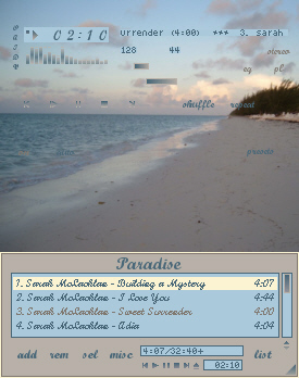
Title: Paradise
Series: N/A
Who: N/A
Font: Script MT Bold
Click here
for larger image.
Notes: My second skin for kita73. This one is from a picture she took
while on vacation in the Bahamas, of which I am extremely jealous.

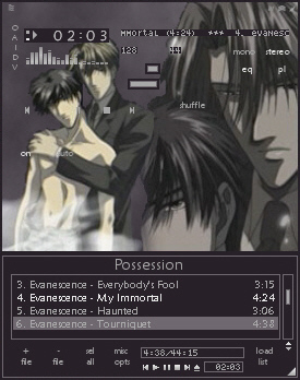
Title: Possession
Series: Mirage of Blaze (Honou no Mirage)
Who: Ougi Takaya and Naoe Nobutsuna
Font: Maiandra GD
Click here
for larger image.
Notes: I think it came out quite nicely. I did do rather a lot of editing of the
image (redoing the background, moving the two halves of the shot closer together),
and I actually started this one over a couple of times before I got the image
I wanted. The play button is missing on the main face, but then it would have been
plastered all over Takaya's face. The site I snitched the original pic from is
called "Boys on Boys on Film", and it is up on the Links page.

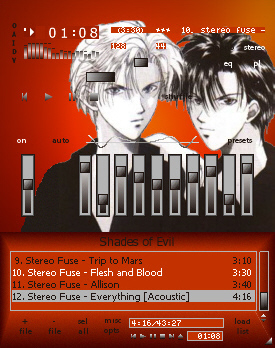
Title: The Shades of Evil
Series: Gravitation
Who: Yuki Eiri and Uesugi Tatsuha
Font: Tahoma
Click here
for larger image.
Notes: Another image to which I did rather a lot of editing before
skinning. The idea that I had in the back of my mind when doing this
one was that they look like twins, one light, one dark, and both so
good-looking that they'd drive anyone to sin. So it kind of evolved
into "Evil comes in many different shades." Hence the name. Original
pic snitched from a great Gravitation site, now listed on the Links page.

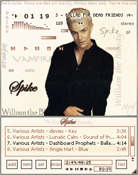
Title: Spike//William the Bloody
Series: Buffy the Vampire Slayer
Who: The Vampire Spike, aka William the Bloody
Font: Tahoma, with Edwardian Script ITC, Poor Richard, Aramis, dearJoe,
DesertDogHmk, Josschrift and Slayer in accents.
Click here
for larger image.
Notes: It took me a long time to get into BtVS. I watched it up through
season six with just passing interest. Then, somehow, despite having been in
three previous seasons, I noticed Spike. Of course, it's all been downhill
from there. *grin* The original image had him standing against a very dark
background, a wooden wall of some kind. Much, much too dark, considering he's
wearing black and dark brown clothes, and I was inspired by another pic I
found on the 'net somewhere (of course I can't recall just where, but if/when
I do, proper credit will be given) to give it the pale background with accent
quotes and such. I hesitate to say that this will be my only skin of Spike, or
even of BtVS, because there's always a chance. But I do very much like
this.

